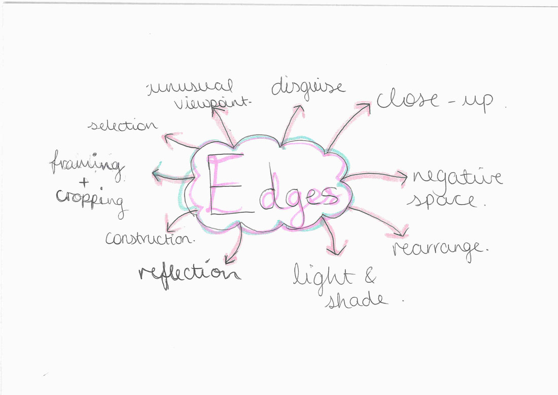
Why are edges so important?
Edges are important because:
- They help to create a mood for the photograph
- They emphasize the object for the photo- make it stand out
- Edges help to give the photograph a shape
- Edges can make a photo more bold and pronounced
- They can block out negative space and anything that could clutter the photo or ruin its meaning/point/purpose
- They can draw attention to a specific area in your image
- Edges in a photo make a framed and this adds depth and balance into the image
- They can keep the background simple if there are distractions nearby(things that could clutter the photo)
- Edges may emphasize the foreground or background more in the photograph
- Edges can give texture to your photographs
There was a time when we thought it was just enough to photograph objects at eye level but then we began to move around, to climb mountains, to soar in airplanes and drop to the bottom of the sea. An we took our camera with us everywhere, recording whatever we saw.
-- Osip Brik, 1926
|

|
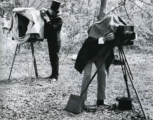
In the first image, we can see early technology in cameras because you had to put a sort of hood on your head to make sure that no light got into the camera so that the picture wouldn't be damaged.When you wanted to take a picture, you had to take a tripod, the hood and the huge camera and it took a lot of effort. This was very hard because when you just wanted to go out and take your camera in your pocket, you couldn't do that because the camera was big, you had to take a tripod and the hood to make sure that no light got in to damage the photo. In the second photo, we can see a smaller camera, one that you could take everywhere without having to bring a hood and a tripod and also the camera wasn't big and heavy.With this camera, you can literally put in your pocket and then go out and take lots of photos without holding a huge tripod and hood, you can take photos without it being so heavy and complicated.
To learn more about edges, we went on a trip to the photographers gallery where we were shown a presentation about Visual Literacy and food art. Mr.Nicholls gave us a view finder with one or more holes in it. We used it to take photos and make them more interesting. below are a some of the pictures that i took with my viewfinder.


Light Angles photoshoot:
The focus of todays lesson was to take photos from different light angles with either artificial or natural light sources and to get the reflection of the light on a mirror.


WWW:
The composition and clearness of the photos
EBI:
We took pictures from different angles and with different light sources.
The composition and clearness of the photos
EBI:
We took pictures from different angles and with different light sources.
Looking up and down photoshoot:
Today we went around the school taking pictures from different heights. The point was to take photos from different views and the edges of different views and heights, in this case it was the edges of different views and heights of stairs all around the school.


WWW:
The views going up and down the stairs, the composition of the photo and how clear it came out.
EBI:
I had pictures of different views and at different heights.
The views going up and down the stairs, the composition of the photo and how clear it came out.
EBI:
I had pictures of different views and at different heights.
Paper Edges
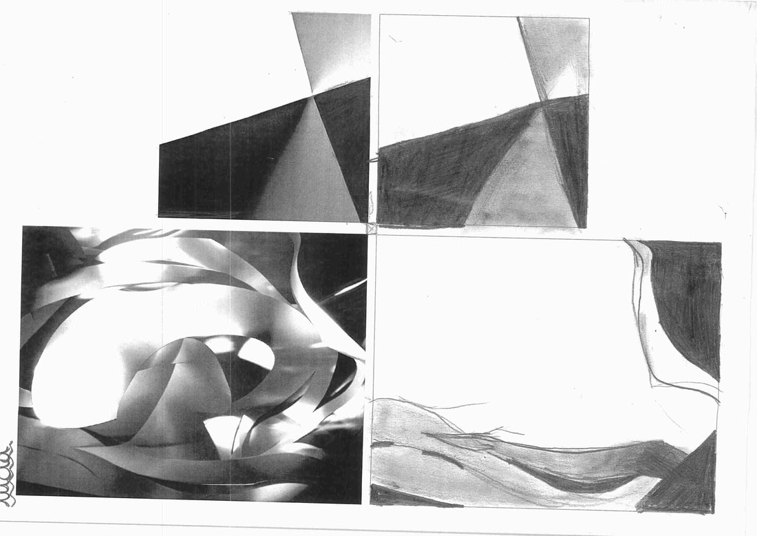
We were given a task to draw the photograph using a pencil and we were not allowed to use a rubber. We had to draw the angle where the light hit the paper. The first image of paper was easier because the composition was made up of just straight lines and because of this, the image was easier to draw. The second photograph was much harder to draw because the image was of a piece of paper which was cut and was arranged so that the paper was in curved lines and we had to look really closely to draw it correctly. The difference between the two was that the first image was made of straight bold lines whereas the second was made of cut , curved paper.
Edges photoshoot:


Today, we learnt more about edges and how to make them just using a piece of paper. To do this, we folded the paper however we wanted and then used the torch on our phones to control the light so we experimented with the intensity, the movement of the light and which angle we were going to put the light onto our pice of paper.
Cut paper edges:
We had to cut paper but try not to cut it so there were no holes and use different light sources: artificial or natural to make photos in the style of Francis Brugiere.


WWW:
The lines make the picture look confusing because you can't really tell that we were taking pictures of paper.
EBI:
There are holes and big gaps where we cut the paper so I need to make sure that that doesn't happen again to let too much light come through and ruin the picture.
The lines make the picture look confusing because you can't really tell that we were taking pictures of paper.
EBI:
There are holes and big gaps where we cut the paper so I need to make sure that that doesn't happen again to let too much light come through and ruin the picture.
Cut paper edges part 2:
We had another go at paper edges and finding different light sources in the style of Francis Brugiere so that we could improve and learn from when what we did in the first photoshoot.


WWW:
There are not big holes/gaps that let lots of light through and the different types of light make the image look very exciting and different and in the style of Francis Brugiere.
EBI:
We need to take more pictures with different compositions and with different light sources and so the viewers cannot immediately tell that its paper so I need to zoom into the paper more and make it in the style of Francis Brugiere.

I like this photo because in the rule of thirds, the top right corner of the rule of thirds there is a cut that sort of separates the paper/photo into a little section. I really like the way that the light comes through the slits in the paper and reflects upwards to the darker sections .
Paper edges analysis


I think that these pictures were mad by cutting lines in a piece of paper, but not to make big holes so that there is an over exposure to the light and the composition gets ruined. Once you've cut lines on the paper, you choose a light source and then take a picture with the light rays coming through the lines and at different angles and also with different light sources: artificial or natural.
The two images have different types of lines and tones of light. In the first image of Francis Brugiere, the lines are curvlinear and quite small. There are some lines which have been cut so that it is a hole and the lines that the light comes through in a larger chunk. There are more curved lines tan there are straight lines. The second image has straight, sharp lines which are very small and close together. It brings out a shadow as the whole image is quite light.
In the first image, the photo as a whole is quite dark and the slits which were cut brings out a white light which brightens the photo and brings a contrast of light because the majority of the photo is shadowed and dark. The second image is quite bright and sharp edged. Where the slits bring out a shadow and a dark light.
The first photo is: dramatic, curvlinear and contrasty.
The second image is: simple, empty and linear.
I prefer the first photo because it is dramatic with the contrast of bright and dark light and has a range of lines sizes, some are thin slits but others are larger and give light rays of contrasting the darker shadows.
Concertina Project
How to make a Concertina:
Equipment needed:
- Foam board
- Colored Craft paper
- Craft glue
- Scissors
- Ruler
- Satin ribbon
- First of all, you'll have to cut 2 square pieces of foam board. Both pieces should be of the same
- The size of these boards should be slightly bigger than the required photo size for this album.
- Cut a piece of craft paper by keeping 1 inch extra on all sides comparing to the foam board. Place a board on the center of the craft paper.
- Cut the 4 corners of the craft paper as shown in this picture.
- Apply glue on the extra part and fold it in, gluing it with the foam board neatly.
- Apply glue and fold the 3 other sides. Similarly cover the other foam
- board with craft paper. This is the wrong side of the covered foam boards.
- This is how the other side (right side or front side) of the covered foam boards looks like.
- Cut a long strip of cardstock paper, I used black cardstock paper.
- The width of the strip should be a little bigger than the required photo size.
- The length depends on how many pictures (picture width X the number of pictures) you want for the album.
- Hold a ruler along the folding line of the strip and fold.
- Create accordion folds on the strip until it ends.
- Keep the fold as neat and even as possible.
- Decorate the front cover as you want.
The process of making my concertina
At first, I didn't want my concertina to be big so I made it to be A6 and then I found that it was quite hard to print out my pictures that small so I decided to make it A4. I finished making it and I found it easier to paste my pictures to a similar size to A4.
For this Concertina project , we had to take photos to do with edges and then put them into our concertinas. I took pictures to do with edges at home:
Photos inside the Concertina


My finished concertina:


Post-It Note Edges
We were given post-it notes and had to make different compositions with them and take photos of them. Here are some I made:


WWW: We used the post-it notes to create different compositions and at different angles.
EBI: It would be better if we took the photos with the post-its on different backgrounds.
EBI: It would be better if we took the photos with the post-its on different backgrounds.
Post-It Note Edges Homework
For our homework, we had to take pictures with different compositions and on different backgrounds that are inspired by Piet Mondrians paintings.


Layering and cutting paper
We used our photos from before and cut them and then layered them using the photocopier. We then used the cut images as a viewfinder and took images around the school using them.


WWW:I layered my photos onto A3 paper and took some pictures using my cuts as a viewfinder
EBI:If i took more photos using the viewfinder
EBI:If i took more photos using the viewfinder
Edges Assessment
In today's lesson we had to pick 5 pictures (they are shown in different compositions below). I chose these pictures because they all have some sort of reflection, window and shape of a mirror in them and the shape/window is the subject.
- I arranged these pictures in this grid like format because the pictures in this way


Robert Frank/Lorenzo Vitturi comparison
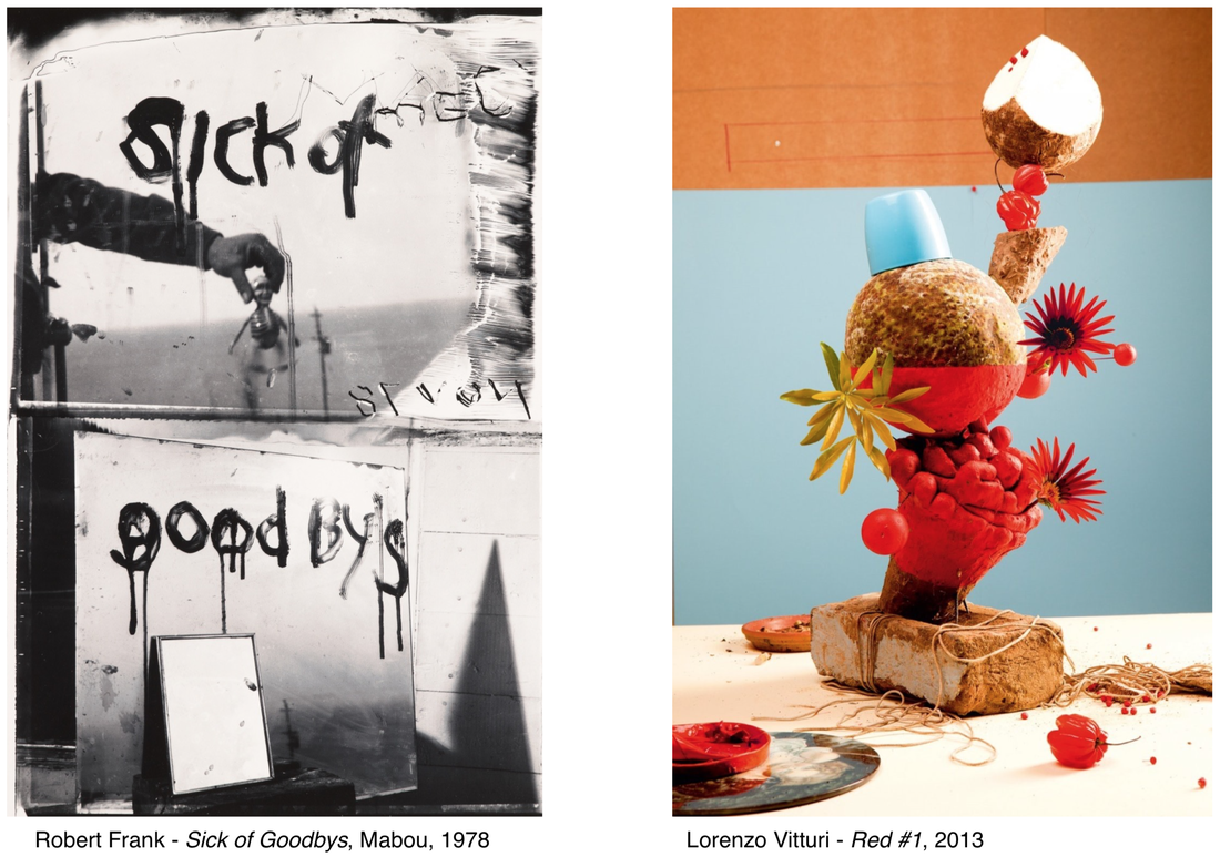
- The first image 'Sick of Goodbys', is black and white. It looks like a dark and gloomy photograph, there are two large mirrors, one on top of the other and have 'Sick of Goodbys' written on them in black paint or something. The second image, 'Red#1', is colourful and bright with lots of red in it(hence the name), there are lots of objects stacked on top of each other which each have different edges, some are sharp and others are more subtle. I think that 'Sick of Goodbys' is a dark and gothic genre, but 'Red #1' is more of a fun and cheerful genre. In 'Sick of Goodbys', there is someone holding maybe a toy, it isn't very clear and in 'Red #1', there is some sort of red food but I'm not really sure what it is. Both of the images are the same but different.
- The things that are similar about both photos is that they both have a range of edges in them, the 2 images are both portrait, they have at least 3 objects in them. The differences of these photos is that one is dark and gloomy whilst the other is bright and colourful, they have different subjects and themes. In Lorenzo Vitturi's Red #1 there is a lot of negative space in the background, it is the middleground that has the sculpture of food and objects stacked up. The background although it has a lot of negative space there is an orange rectangle at the top of the page, which might be a studio room, then below, the blue space is a sort of backdrop and then there is the table where the sculpture is. In Sick of Goodbys, the most interesting part of the photo is the mirror which has 'Sick of Goodbys' written on it and then there is a hand holding a doll or figure on it and then in the background, you can see a landscape of the sea and the sky above it. In Red #1, I think that the sculpture itself is the most interesting because it has a range of food , mainly fruits and then some objects stacked on aswell.
- There are a variety of edges in both photographs . In Frank's photo, the edges are more simple and geometric. There are rectangles, squares, triangles in the picture whereas in Vitturi's photo, the edges are more organic and there are more edges in this. Each photograph helps me think about the relationship between edges and photography because everything has edges and , every single photo has edges in them and these two photographs have edges but different types of edges. If I could talk to each of these artists , I would ask them :
- Why did you choose this specific composition for your photographs?
- Why did you choose your photo to have this genre? and
- What is the meaning behind your photograph?
- If I could give each of these photographs a name, I would name them
-Lorenzo Vitturi 'Red#1' would be called 'Diversity' because it is very different to other sculptures and because all of the fruits come from different places around the world and are very different from each other. These fruits symbolise how diverse London is and how nobody is the same to anyone else.
Edges extended learning enquiry
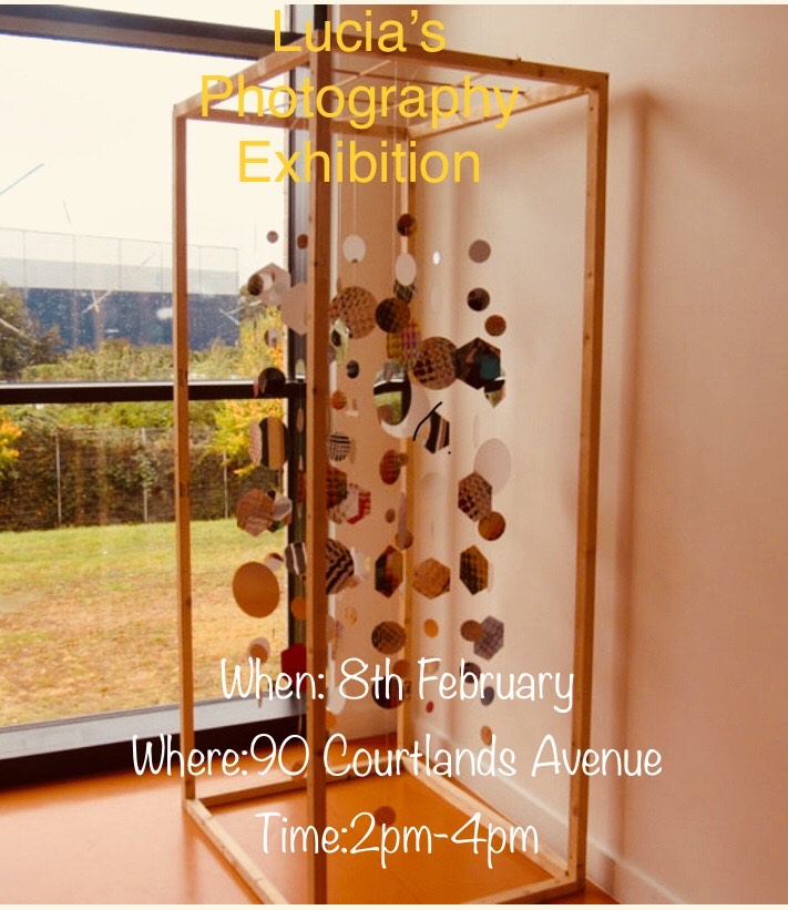
For my homework, we have to make an exhibition and invite people to come and give you feedback on it. This is my flyer/invite:
I have chosen my favourite images that I have taken and i will make an exhibition if these photos and invite people to come and see them. Here are the photos:


The exhibition
My exhibition took place on Saturday 8 February and I invited my family and some friends . I put up my photos in the living room and corridor with captions on each image so people wouldn't be confused as to why I took these images. I also made a feedback forms for everyone who came to fill in and tell me what they liked and how the exhibition was for them.


Evaluation:
WWW:
I like the different types of edges that I have taken pictures of. For example, the second picture has the edge of a music stand and then there is the edge of a curtain.
EBI:
It would be better if I took more photos of paper edges like we've been doing in class.
WWW:
I like the different types of edges that I have taken pictures of. For example, the second picture has the edge of a music stand and then there is the edge of a curtain.
EBI:
It would be better if I took more photos of paper edges like we've been doing in class.
Personal Edges Project


Today i went out with a mirror and started taking reflection photos. I went to the water fountain and then put some water onto the mirror and this is how they came out. The last two images are some of these images layered.


