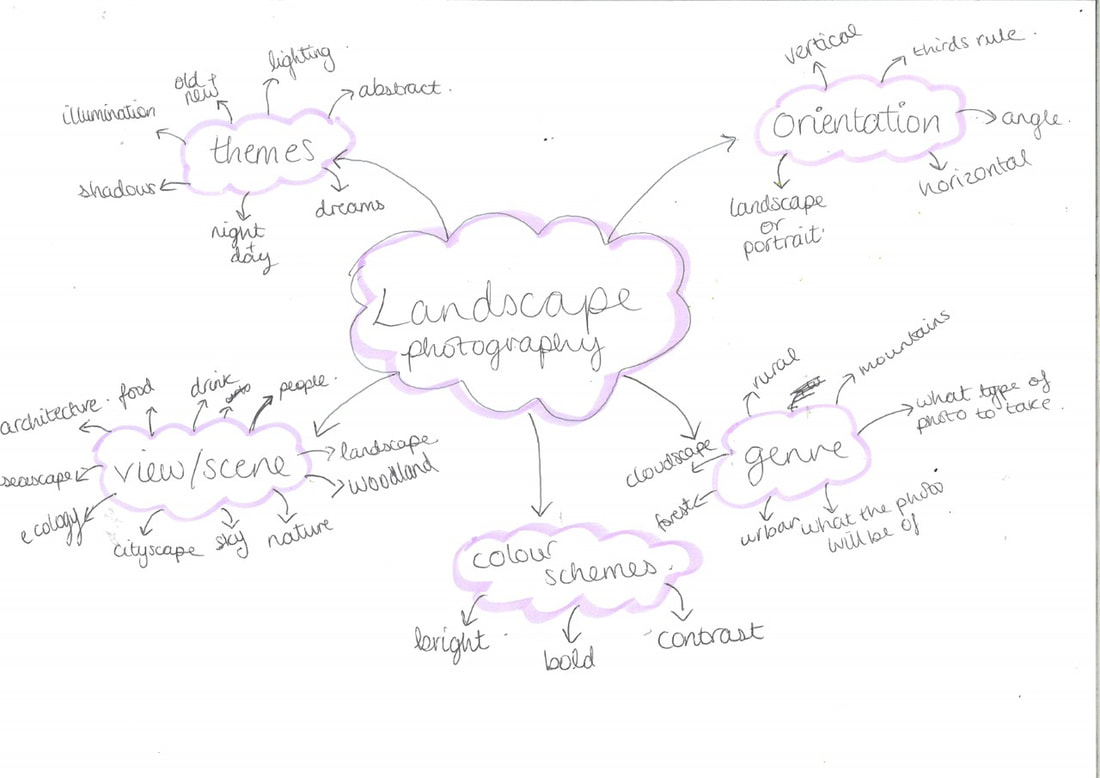
My landscape photography mindmap


These are landscape images that were taken on a safari in Kenya and are conventionally beautiful landscape images that are most commonly taken by people today.


I think this is the best photo that was taken today because I like the way the edges are blurred and then refocus at the centre of the image where the nature and subject of the image is.
Homework
For my homework, we had to take landscape photos outide of school. Most of mine were taken in Greenwich Park so the main feature is trees and open space.


I think that this is the best landscape photo I've taken because the clouds in contrast to the road is very dramatic and bright. The horizon is in the first third of the image and makes the road look like it's never ending, it gives a sense of future and wondering of what's to come and what is at the other end of the road. The photo really works with the rule of thirds and what is in each section of the photo.
Bad Landscapes
I also took images of what I thought were bad landscapes, so images that are interrupted , don't have an obvious subject, a bad camera angle and ones that are blurry. These are the 'bad' landscape images I took.


These are bad landscape photos because the landscapes are being covered or blocked by items and objects. The subjects of these photos are unclear and they are bad because none of the images follow the rule of thirds.
Roger Fenton/Richard Prince comparison


Some prompts to help you:
- Describe what you can see in each picture - focus on the overall impression of the pictures and what you notice about them. What do the two pictures describe about the world?
- Identify the main similarities between these pictures?
- Identify the main differences.
- Explain which details in each picture strike you as most important?
- Explain how each picture makes you feel. What ideas or sensations do you have when you look at each of them? What is/are the source of these feelings/ideas? Where do they come from? What do the pictures suggest about landscapes and people?
- Explain which of these pictures seems (to you) to be most accurate or reliable as a source of evidence about something.
- Both of these pictures are famous partly because they are controversial. Can you suggest why?
In the first image , most of what we can see is the ground and a small section at the top where we can see the sky. Even though the photo is in black and white, the sky looks very dull and grey. There is a pathway that leads up the image but we cannot see where it stops or where it leads to. This gives us a sense of hope and mystery ,looking out into the future, not knowing what comes next or what will happen. The image also gives an eerily clam setting because there is nobody there and is called the valley of the shadow of death where lots of soldiers were killed in the war in Crimea. There are cannonballs on the ground which further suggests the image that many people, in this case soldiers, have been killed. There is a shocking amount of cannonballs which shows me that whoever shot them wanted to make sure than nobody was left alive, that nobody survived. In the second image, the first difference I see is that the image is in colour. Also most of the frame is taken up by the sky which has a very vibrant blue colour with lots of clouds, with only a small part where we can see the ground. In this photo, there is a cowboy riding a horse, his body and face are almost like a silhouette - we can't see who is under the hat, we do not know who they are. This image also gives a sense of hope and mystery because we can't see where the cowboy is going and we can't see where the road leads to. In his hand we can see a lasso which gives the impression that he is maybe going to catch something - maybe an animal or it could possibly be a person. What strikes me the most in the first image is how eerily calm the atmosphere is and the amount of cannonballs on the floor but in the second image, the cowboy riding off strikes me them most because it makes me wonder where he is going. Both images make me wonder where the roads lead to. At first the first photo gave me an eery sense of calmness but once I had learnt what the photo was of and what happened before made me feel more negative because the photo was of cannon balls that were shot at soldiers who came to divert them in a war. the second photo made me feel a little bit better because it was in colour and the colour of the sky was a really rich blue. The cowboy riding off gave me a sense of confusion as to where he was riding off to. The first image is the most reliable to me because it was taken in the exact spot that the cannonballs were fired. But the second image is the background of a smoking advert.
Disrupted landscapes
I printed out some of my previous landscape photos and took photos of them around school in different settings effectively making them distrupted by the background .


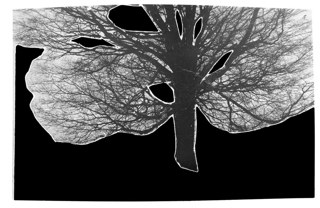
Ray Metzker’s ‘Pictus Interruptus’ series.
|
Ray Metzker’s Pictus Interruptus photo series seems very puzzling at first glance . This series was landscapes and cityscapes that have been disrupted by abstract elements. To make these images, was very simple but the effect is amazing. His simple work of a single object being ‘interrupted’ makes it seem more interesting to look at. He manages to make the land and city scapes look almost completely unrecognisable as we are able to see little clues as to what exactly the image is of.
|
|


Constructed Landscapes
Geraldo de Barros - from the series Sobras, 1996
|

Liz Nielsen - Gardening with You, 2020, Photogram
|
Try to respond to these prompts in as much detail as possible:
- Describe what you can see and what might be missing from both of these landscape photographs
- Describe what you find surprising and/or unusual about each of them?
- Explain how you feel when you look at each of these pictures?
- Explain how you would attempt to make pictures like these.
- Suggest why you think each artist has removed parts of the landscape.
- Explain which of these pictures you prefer and why?
- Experiment with several different techniques for creating landscape photographs in which parts of the image have been removed.
In Garros de Barros image, I can see a large tree which is surrounded in black. Two thirds of the image is black and this is covering what is behind the tree and underneath. Behind the tree is probably the sky and underneath it is most likely the ground and mud where the tree is standing on. The black sections of the photo make it look unfinished and like something needs to fill in all the empty space. In Liz Nelson's image, you can't really tell or understand what exactly is going on but i can make out that there is something that looks like a large plant or bush and in the bottom right looks like a bucket that has gardening tools in it. Behind the bucket looks like sheers and further back looks like a spade or shovel that could be leaning against a wall or it could be a part of the wall or building behind.There is a lot of empty space in the image and there is not that much going on. On the left image, the fact that most of the image is covered in black is quite suprising to me because we don't know what the photographer has hidden although it is most likely the sky and the ground which the tree stands on. This picture is unusual because the artist has hidden a lot of it which leaves the blank space to the viewers imagination. In the second image, the vagueness of the objects and what they are is quite unusual. Nothing really strikes me as being unusual because there is a minimal amount going on. This image is unusual in view of the fact that the main subject of the photo slightly to the left is not very well defined, I can't make out straight away what it is. We have an idea of what the subject is but other than that I can only assume what the other objects in the image are. When I look at the images, they both make me feel confused and a little perplexed as there is a lot of empty, blank space in the images. In the first image we are wondering what the artist has hidden and covered in black and why he did it. in the second image, there isn't a lot of objects/items in it, it is quite minimalistic. This makes me feel even more confused as to why there is so little on the white background and what the objects That are there are. It is more abstract and what you see each time you look at it changes whereas the left image gives off a more mysterious vibe since even the little bit of sky we can see looks very grey and not very sunny. To make pictures like the first image i would take a photo of a large object that has things in the background and then edit it and block out everything that isn't the main subject giving the viewers only a small glimpse of what may be behind the main object. To make to second image I would get white paper and then black card and cut out shapes on the black card and stick it onto the white paper. I would cut out simple shapes the imitate Liz Nelson's image. There is not an image that I prefer out of the two because whilst one is mostly black, it is also quite mysterious whereas the second image is quite blank and plain but every time I go back to look at it, I can see something different. Both of the images have something that confuses me but they also have something that intrigues me into wanting to look at it more.
Homework: take landscape photos featuring trees and water
For my homework, I had to take 20 landscape photos that feature either trees or water.


Landscape Photograms
We created a landscape image inspired by Liz Nelson using white paper and black card. I used the white paper as a background and cut up the black card into shapes and arranged them onto the white paper. I tried to imitate Liz Nelson's style of using minimalistic shapes but my image has a little less empty space. After this, I went into the dark room and used the enlarger to put my image onto photo card. I let the photo be exposed to the enlarger for 18 seconds and once the light turned off I took the card and put it into the developer for the image to develop for around 1 minute. Once I am happy with how the image looks I take it out and out it into the stopper to stop the image from developing more, I leave it there for around 15 seconds. Finally I put my photogram into the stopper for 3-5 minutes and then I wash all the chemicals out. Beneath are my images, the first two are the ones I created with the black card and white paper and the final images are my photograms. Each image has a negative print .


Photoshop montages


Brea Souders
Whilst on google maps, Brea Souders discovered glitches in the photos that were made by the algorithm to take away the features/bodies/faces of the people who took he images as to help protect their identity and personal privacy. This algorithm made distrupted shadows, body parts floating in mid air, and body parts e.g feet to be left behind. Brea Souders took screenshots of these glitches and then probably used photoshop to edit the images as the screenshots aren't quite natural screenshots of the glitched algorithms. Her images make the images look more interesting and intriguing as she edited them in a way that provokes deep thought and makes you wonder about the different elements into the image. The image backgrounds look so peaceful and beautiful but the blemished shadows create a slightly darker , uncanny atmosphere. Whilst we can tell that Souders has used photoshop to edit these images, we also cannot tell what exactly she has done to create her images. Below are some of Brea Souders' images:


After, I found some glitches and took some screenshots on google maps inspired by Brea Souders which are below:


Dafna Talmor


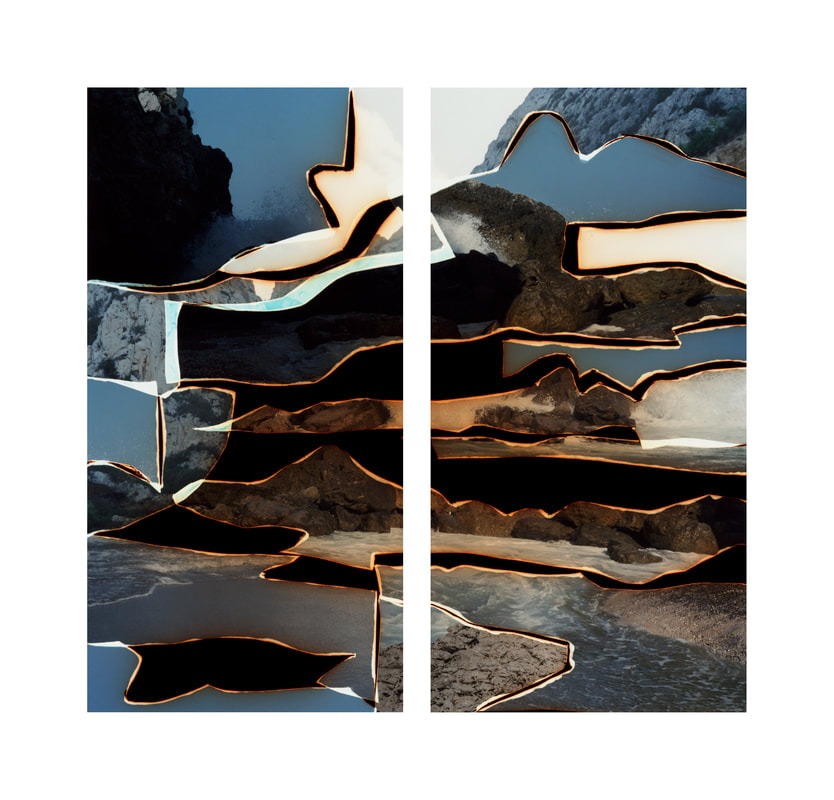
This is my favourite constructed landscape that Dafna Talmor has created because it evokes a lot of questions . This looks like two separate images but they’re actually just one. But even with the gap I can see that the images connect with each other. The process that Talmor has used in the above video shocks me quite a bit as I would never of guessed that she used the process that she did. On her website she says that she wanted to engage the ‘analogue/digital divide and the effects they have on photography’s status’. This told me that she used both digital and non digital methods in the lengthy process of creating her photos. She has not only used her own photos and merged them together but she has also arranged them and photographed them in a way that intrigues you and makes you ask a constant flow of questions about the process and images in this project itself. She made this through lots of different landscapes in different countries and merged them in a way we couldn’t possibly tell where or when they were taken.
Abstract Advent


Constructed Landscapes:Making day
Viviane Sassen
|
Viviane Sassen is a Dutch artist who has been widely exhibited and published. She is a photographer who works in both the fashion and fine art world. She is mostly known for her use of geometric shapes used to create her images. Most of her photos have many coloured rectangular pieces of plastic that appear to be floating mid air at first. In addition, she uses a mirror to derange the reflection of the colourful plastic placed on the floor. Below are some of her most famous pieces:
|
|


My response to Vivianne Sassen
Alice and I went around the school with colourful pieces of plastic and placed them in different positions and sometimes used a mirror to deflect the reflection. We wanted to experiment with the plastic in response to Vivianne Sassen. Whilst we were outside we arranged the plastic into different compositions and arrangements. Here are the images we made:


Constructed landscapes
Today we were given a variety of 35mm transparency slides that my teacher got on Ebay and we used them to adapt the slides to make them into constructed landscapes by using a scalpel to cut them, using parts of other slides, ink, coloured cellophane and tapes to adapt them. I used the scalpel to cut out different shapes and scrape off some of the material off the slide to create a different texture . In the second image i added ink to my adapted image. I used the tape to stick the different parts of other slides I had cut up onto my original slide that I was adapting to make sure that everything stayed in place and the composition o had arranged didn’t change in any way I didn’t want it to. As this was the first time that I had made a constructed landscape physically on a slide with other images on film, the first slide didn’t come out perfect . It looked more abstract than the second slide which had different elements on and in it. Once I knew what to expect after the first, it was easier to adapt and change some details. The second slide has more going on because there is ink on the slide, I had scraped some material off the film to add a bit of texture which hasn’t really shown because of the sticky tape. This process was challenging for me as the slides were so small so a lot of attention and concentration was needed when cutting and sticking slides. Another difficult aspect was that we can’t really tell what the slide looks like until it goes into the slide projector so whilst creating our landscapes we don’t exactly know how it looks.
Overall, I think my constructed landscape slides came out quite well considering this was the first time I’ve done something like this but if I do it again I would try out a different method of sticking the additional parts down so that when the slide is in the projector, everything would be able to be seen including the different textures and indents in the film.
Overall, I think my constructed landscape slides came out quite well considering this was the first time I’ve done something like this but if I do it again I would try out a different method of sticking the additional parts down so that when the slide is in the projector, everything would be able to be seen including the different textures and indents in the film.


The chemigram process
Pierre Cordier invented the chemigram in 1956. Chemigrams combine the physics of painting( wax and oil) and the chemistry of photography (developers and fixers), without a camera, enlarger but in full light. Cordier discovered how to make an image just using light without a camera by using reists on photographic paper. He used nail polish, put it onto photographic paper adn then expose it to light. Then when you put it into a chemical developer, different areas of the paper turn darker, forming an image. Once the image has developed to the extent you want it at, it is then placed in the stop and fix so the light sensitive layer of the paper is removed so the image can be exposed to light without the image changing. This dissolution can create beautiful, intricate patterns. To create a chemigram, you don't just have to use nail polish, you can use varnishes, syrups, glue, adhesive, pens, etc. You can also add things like, sugar and salt to this physio-chemical process. Here are some examples of chemigrams, some created by Pierre Cordier.


Alice Canzaneve workshop
Today, Alice Canzaneve came in from the Sustainable Darkroom and taught us how to make an environmentally friendly, sustainable developer and we used it to make a chemigram we made from rosemary tea , vitamin C and soda crystals. Here are some of the chemigrams that i made:


My Personal Project
|
For my final project I have been experimenting with disrupting landscapes but I've been particularly interested in using paint to disrupt my landscape images. I printed out some landscape images and then used some acrylic paint on top of my printed image. We used a glass A4 slide and put some different colours of paint onto it. Then, I placed my image on top of the paint and then peeled it off. This was a random experiment so I had no idea how the paint would look on the printed photo. This experiment helped me to see the variations of ways I could disrupt my landscapes by using paint.
The last three images are my landscapes photoshopped and layered underneath the paint prints. |
|


Over the next couple of weeks I was mainly focused on taking landscape photos for the two making days which I was going to adapt to disrupt the landscape and use as a background to edit . Here are some photos that I took around where I live:


Sarah Anne Johnson
|
|
Sarah Anne Johnson is a canadian artist who works with oil paints and works with the themes of utopia, hope, human relationships with the environment. Johnson alters the image she creates in any way she can to make it fit the meaning of her work. She used acrylic paint on her landscape images and then "transformed the photographs with paint, metal leaf, holographic tape, photo-spotting ink, and photoshop to create a more honest image that reflects my personal experience with the landscape. The work is informed by scientific research on the ability of trees to communicate intelligently, traditional indigenous knowledge about nature and the influence of ancient trees on sacred architecture.". Johnson used the forest around her home in Manitoba to take her photos. She used acrylic paint to disrupt her landscapes and these elements was what my project is based on. I wanted to take landscape images from around the area I live in and construct it, adapt it to look more alive and colourful. I live in a city which is very polluted and this takes a toll of the environment, many plants such as the trees lose some colour due to this so I wanted to add more colour and alter the way I looked at the landscape and the environment.
|


|
Once I printed out some landscape photos, I used a white marker to outline the trees (subject of photo) and filled some of the object in. I then used a paintbrush, dipped it in water and used a thick paintbrush to put water droplets onto my printed photo. After this, I took water colours and used another brush to take the paint and put it into the water droplets. This made the printed image look more vibrant and coruscating. I used the water and paint for two images:
|
|


Once I had finished positioning the paint into the water droplets, I took photos of them which are above and then used photoshop to edit the new images with some landscape photos by layering them on top of each other with phtotos I previously took for my final project.


Final Project Evaluation |
Throughout my final project I have researched many artists, but Sarah Anne Johnson's work really reflected what I wanted to accomplish with my landscapes. She used acrylic paint to alter and refine her landscape photos and used colour to do so. So my final project is in response to her work.
Over the year I have experimented with different processes and techniques to try and 'disrupt' landscapes. For example, slides, slide projectors and physically layering parts of slides to create one constructed landscape slide. I have also used photograms, google maps, chemigrams. At the beginning of the project I wasn't quite sure as to how exactly I wanted to disrupt my landscapes so I used a landscape image and printed it out in only one colour and then used acrylic paint and put splodges of it onto a glass A4 slide. I placed the printed photo on top of the different colours of paint and peeled it off. Once the paint was dried we used photoshop to edit the photos but I wasn't really happy with the final composition of it . I then found Sarah Anne Johnson and her pieces instantly captured my attention because of the way she presents her work and the way in which she carries out her experiments. I reviewed and examined a range of her works, the style and techniques she uses to create her pieces. I couldn't fully recreate my images using the same processes that she did so I took more landscape images and once I printed some out, I stationed some plastic cellophane on top of it and started to begin the process of disrupting my landscapes.
As I explored the different ways of trying to alter and change my landscapes, I took a large paintbrush and after dipping it in water, I started positioning my water droplets onto my cellophane coloured images. The aim of my project wasn't only to construct my landscape images but I wanted to make them seen more vibrant and lively and I realised the way of achieving this was by adding colour to my composition. So I used water colours and injected the water droplets with the paint with a smaller paintbrush. Once I was finished placing the different colours into the drops I was much happier with how my work has changed since the beginning of the experiment.
Throughout my project I exercised persistence and used my imagination more to develop my ideas into the final outcome. I struggled with trying to refine all the different ways I could change my landscape pieces and not changing my mind constantly about what technique or process I was going to carry out on my images. Being persistent aided me into producing a final project that I am really happy with. At the beginning of the project I knew that I wanted to use colour and paint to construct my landscapes, so finding Sarah Anne Johnson really helped me to cement my aim.
My final outcome are the photos I edited in photoshop. I used one of my paint droplet pictures and layered it on top of one of my original landscape shots. I then used the different effects to layer my images into a composition that you could notice two photos merged together to give a sense of similarity and also to give a sense of unfamiliarity by choosing the different colours and turning some into negative versions. By doing this I wanted to show how by altering a landscape slightly, can make it look so much more full of life because there weren't really a huge variety of colours in the prints I took around where I live and some looked quite dull. Today there is so much destroying the environment that causes wildlife and organisms to slightly discolour, deform and can cause how we see the world through our eyes to be different and I wanted my project to bring out some colours that we should be so used to seeing everyday - everywhere we look. But over the course of my project I have learnt how photography lends a hand to destroying the environment. I wanted my project to explore the theme of developing normal landscape images that may look toned down due to the environment constantly, gradually changing due to the increase in global warming, and using colour to add more life and pigment into my images. I wanted to do this to express my feeling for the environment around me and add colours to the landscapes that we should be accustomed to seeing all the time. The workshop with Alice Canzaneve from the sustainable darkroom showed me how malignant chemicals are used to develop and create photographs. This really gave me the push to try and use more environmentally friendly ways to complete my personal project and try to reduce the amount by which I am unknowingly helping in destructing the world around me. So instead of using acrylic paints, I used water colours to inject the colour into my shots of the scenery and disrupt them and worked digitally using photoshop instead of using more paper that is produced by expansive deforestation and has already started to dismantle the planet.
I feel like my personal project is linked to threshold concept #10 : Photographs warp our sense of time; they remind us of things lost , because if the photographs I took were taken fifty years ago, they would have looked much more colourful and lively whereas now, there are a lot of clouds which reflect pollution and the lack of and variety of colour exhibits how much the environment has changed and how it is being continuously destroyed. The lack of leaves on the branches on the trees, even though we are late into spring, also convey the lack of entity in my images and the sense of despondency the trees radiate.
I chose to work digitally because I thought that it would express my work and the concept of the project: constructing and disrupting landscapes, better than if it was in a physical form. Doing this, I think that I have successfully explored my theme of constructing my landscape by adding more hues and shades to an otherwise duller landscape featuring a minimal selection of colours. If I had more time, I would've used a wider range of colouring and different landscape images taken in different locations, e.g away from where I live to show a contrast in how the environment is seen. In addition, I would have liked to of tried some more new techniques and processes to transform my pictures and maybe try out new techniques in photoshop.
My photographs are personal because I took them more or less down the road I live on and are scenes that I walk/drive past almost everyday. Seeing the discoloured scenery sometimes dampens my mood and creating these constructed landscapes have helped me to view these landscapes differently and that is what I want an audience to feel when they look at my work. I hope that viewers of my final project will understand how I have 'constructed' and 'disrupted' my lanscapes and can see how I have added more pigmentation and brought my images to life - revived them. Overall, I am pleased with my final outcome and have found the process in producing it challenging but exciting.
